We are sure you have a perfect design. But sometimes somewhere along the road, mistakes can happen. Have you ever experienced printing something that didn't come out the way it should? It's frustrating, right? It's even more frustrating when it's a print design mistake that could have easily been avoidable.
Here are the common print design blunders and how to easily avoid them:
Printing

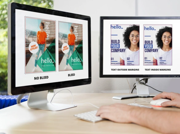
No Bleed
Though the guillotine machine has become more accurate in cutting your artwork to its intended size, it is still possible that it will be off by a millimetre or two. If you don’t add bleed, your final artwork might have a thin white border.
How to avoid: Create a bleed or extra space of about 5mm around your work area. This will make sure that even if the paper moves in the machine, there won’t be a thin white line at the edge of your print.
Going Beyond the Safe Zone
As previously said, there is a possibility of the paper moving in the cutting machine. While the blade can trim outside the cutting marks, it can cut inside as well.
How to avoid: Create a margin or safety zone of at least 5mm within your work area. Avoid placing text and images beyond that margin. There is a risk that the texts and images will be cut unintentionally. For some products such as booklets and books, you need a larger margin on the area where the spine is located.
Off-Centre Borders
It is discouraged to include borders even if it is a popular print design trends in 2019. There is always the risk of cutting within or beyond the trim line, creating an off-centre or uneven border.
How to avoid: If you are set on including borders in your artwork, make sure that it does not go beyond the margin of your workspace. If you want to place the border at the very edge, make sure to extend the colour all the way from the safety edge to the bleed. This is to make sure that the border is not trimmed off and there won’t be a thin white line when the artwork is trimmed.
Imagery

Printing in RGB
Are you wondering why when you’re printing a flyer or postcard the print's colours sometimes don't match the colours on the screen? We have an answer for you: your document might be set to RGB colour mode.
Artworks and documents set to RGB are supposed to be viewed on a screen. Those set in CMYK are meant for print. Though they share the same colours, there are some colours in the RGB colour mode that cannot be created using CMYK. This results in your print not matching the colours on screen.
How to avoid: If you are creating something for print, make sure the colour mode of your design document is set to CMYK.
Low Resolution
The best kind of print material has clear and sharp text, images, and graphics, which means that the design has to have a high resolution. Images and graphics in low resolution often result in blurry and grainy-looking print.
How to avoid: Use artwork or photos that have a resolution of 300dpi, especially when you’re placing them on small products like business cards, flyers, and booklets. For larger products such as banners and flags, the resolution can go as low as 150dpi.
High Ink Coverage
Images that require too much ink to print will cause the paper to bruise or wrinkle. Paper can only absorb a limited amount of ink.
How to avoid: Use a preflight tool to check the ink coverage of your artwork. It will check which of your images require too much ink so you can edit them accordingly. If available, use a preflight tool made especially to reduce the high ink coverage of your artwork.
Texts

Small Text
Printing text smaller than 6pt font size can be tricky. Documents with a small font size can result in unreadable or blurred text.
How to avoid: Set your smallest text to at least 6pt in size. Going any smaller will make the text illegible. If the font has thin strokes, make it bigger to boost visibility.
Missing Fonts
When you are using fonts not recognized by the computer of your local print shop or online printer, it will create the error "Missing Fonts". The computer will substitute the font with another, resulting in a completely different design.
How to avoid: The best way to avoid this error is by rasterizing or converting your text to a Smart Object in Photoshop. If you are using Illustrator, convert your text to outlines.
Spacing
Extra spaces between lines of text in a press release, or uneven margins around an image on a flyer may not look very noticeable on a computer screen, but when printed, they can be incredibly displeasing and distracting to the eye.
How to avoid: It's always a good idea to print a rough copy to get a true idea of what the finished piece will look like.
Spelling & Grammar
This should go without saying, but nothing is more embarrassing than letting a basic spelling or grammar error to go to print.
How to avoid: Proofread, proofread, proofread. If spelling isn't your strong suit, ask a friend or colleague to be your proofreader. Computer spell check functions are useful too, but be careful – they're not fool proof. For example, had we typed 'full proof', spell check would not have noticed!
Errors are inevitable, but there are ways to prevent them. Before sending your artwork to your local print shop or online printer, double-check your work to prevent them.
If you need any more advice on getting your designs picture perfect for printing, don't hesitate to get in touch!

